
Brand Identity & Print Design: Sunrise Charters
The Client
Sunrise Charters is a fishing charter business based in South Padre Island, offering guided trips for anglers looking to get out on the water.
Like many charter businesses, they grow almost entirely through word of mouth and social media; meaning first impressions, whether on a phone screen or a business card handed off at the dock, carry a lot of weight.
The Challenge
The client wanted a logo with real energy behind it; something that felt exciting and captured the thrill of the catch, not just a generic boat-and-water mark. He also needed print materials, business cards and a brochure, that could hold up in person and reinforce the brand the same way his social presence does.
Our Solutions
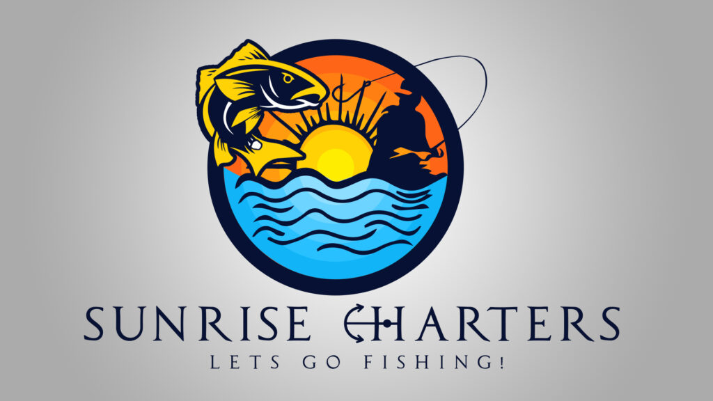
We designed a logo built around motion and color: a leaping gamefish breaking the surface against a sunrise-over-water scene, framed in a bold circular badge with an anchor accent tying into the name. The palette (gold, sunrise orange, and ocean blue) was chosen to feel energetic on screen and still print cleanly at small sizes.
From there, we extended the brand into a matching set of business cards and a brochure, giving Sunrise Charters a consistent, professional look across every touchpoint — from an Instagram post to a card handed to a customer on the dock.
The result is a brand mark exciting enough to stop the scroll on social media, with print materials built to back it up in person.
Ready to Work?
One conversation will tell you whether we're the right fit — no pitch deck, no sales runaround.