
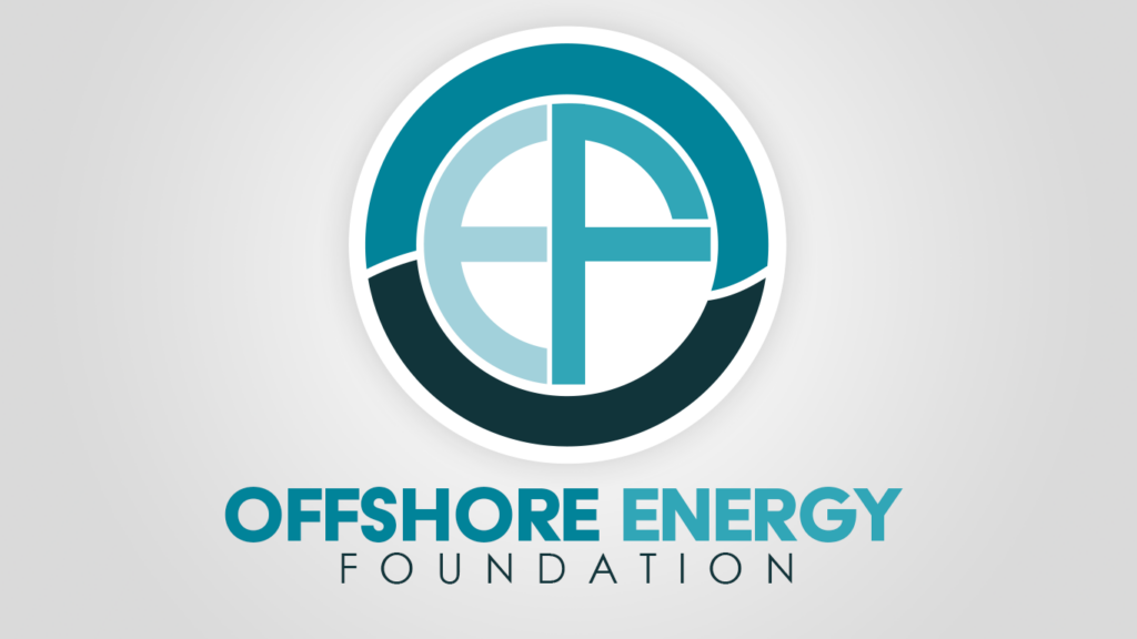
Logo Design: Offshore Energy Foundation
The Client
Offshore Energy Foundation (OEF) is a Washington DC-based political action committee focused on offshore energy policy and industry advocacy.
The Challenge
OEF needed a mark that could represent the organization across formal materials, digital presence, and stakeholder communications in DC; something clean, credible, and instantly tied to their focus on offshore energy.
The design also needed to work as a monogram, built from the organization's initials, while clearly conveying an ocean and nautical feel.
Our Solutions
We designed a circular monogram built from the letters O, E, and F, using a layered ring in deep teal and navy to evoke water and horizon.
The interlocking letterforms sit inside a clean white circle, keeping the mark legible at small sizes; from a business card to a website favicon; while the color palette and circular motion reinforce the offshore, nautical identity the client wanted.
The result is a polished, professional mark built to hold up across formal DC-facing materials without losing the ocean-forward feel that was important to the client from the start.
Ready to Work?
One conversation will tell you whether we're the right fit — no pitch deck, no sales runaround.