
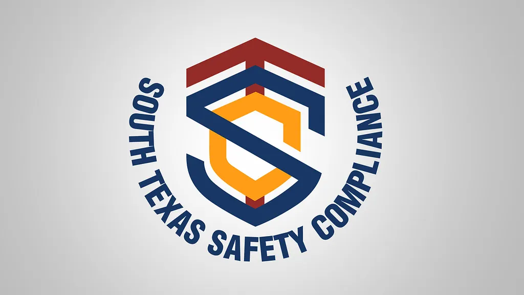
Logo Design: South Texas Safety Compliance
The Client
South Texas Safety Compliance provides safety compliance services for the trucking industry in South Texas.
The Challenge
A compliance company needs a mark that reads as credible and authoritative at a glance — something that signals trust and protection without looking generic or overly corporate, and that holds up on trucks, uniforms, and official documentation.
Our Solutions
We built the logo around a shield form, using an interlocking "S" to represent the company name while reinforcing the sense of protection and standards enforcement central to the business. The navy, red, and orange palette keeps the mark bold and highly visible, and the arched wordmark wrapping the shield gives it the feel of an official seal — appropriate for a company whose job is literally about meeting standards.
The result is a clean, confident mark built to represent a compliance-focused business across everything from fleet vehicles to inspection paperwork.
Ready to Work?
One conversation will tell you whether we're the right fit — no pitch deck, no sales runaround.